

CASE STUDY
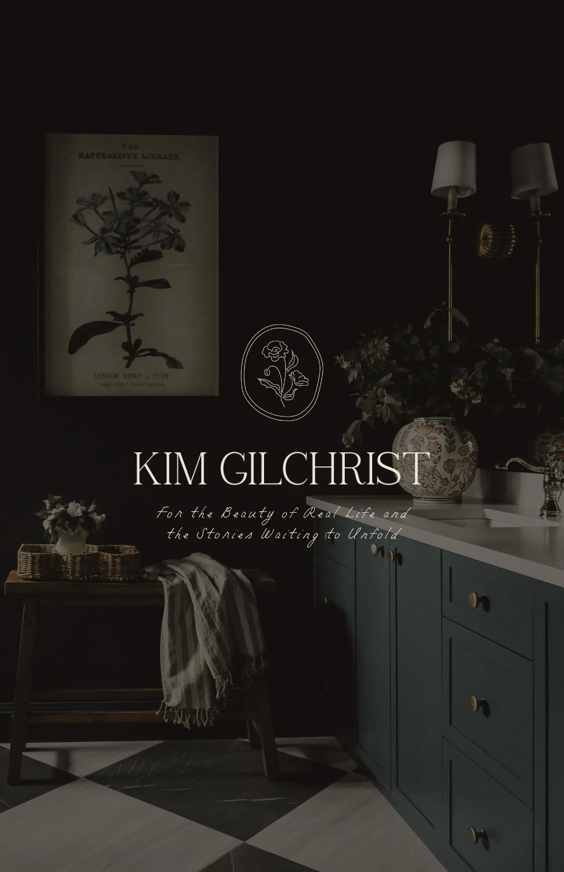
KIM GILCHRIST | INTERIOR DECORATOR

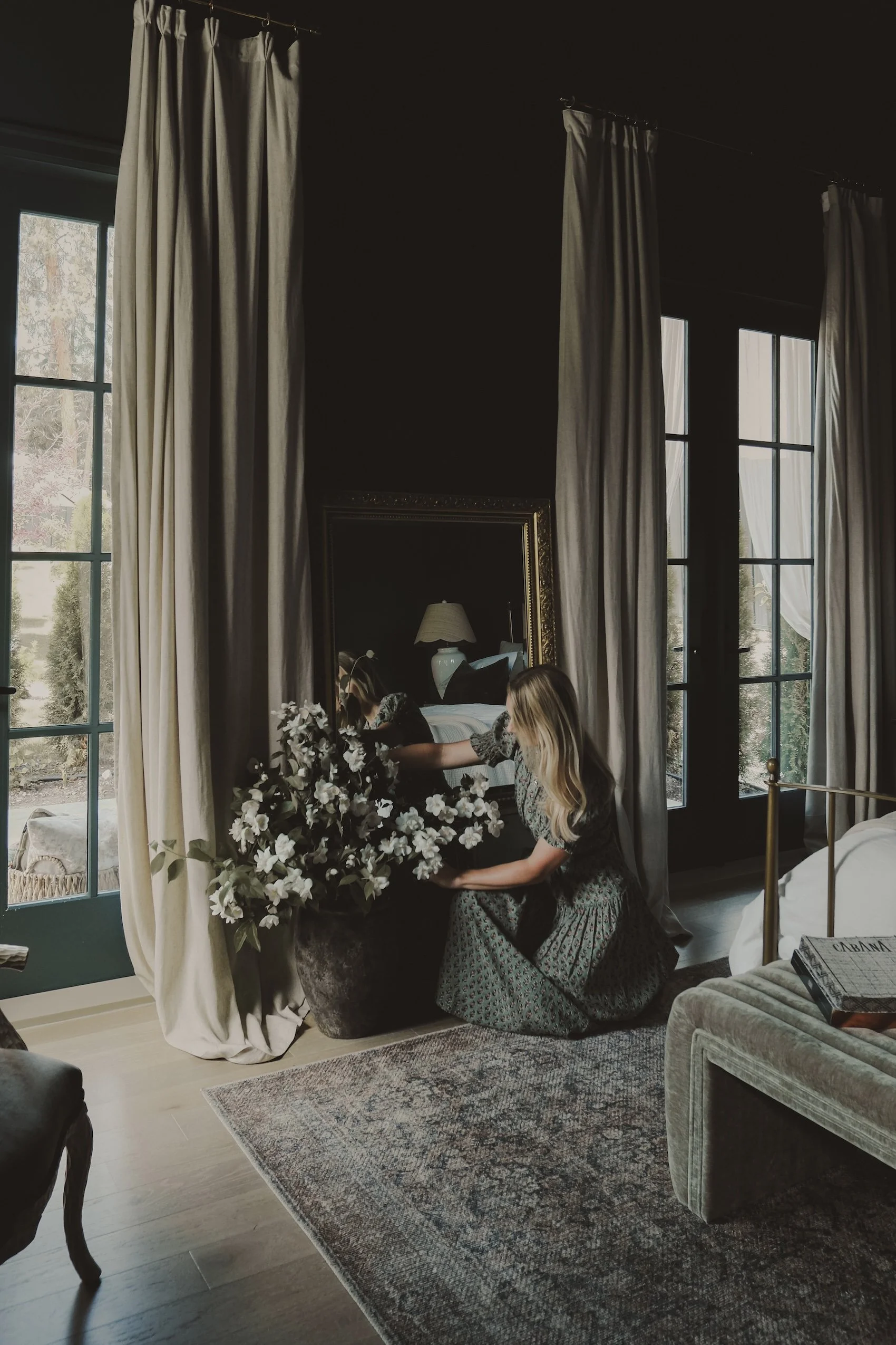
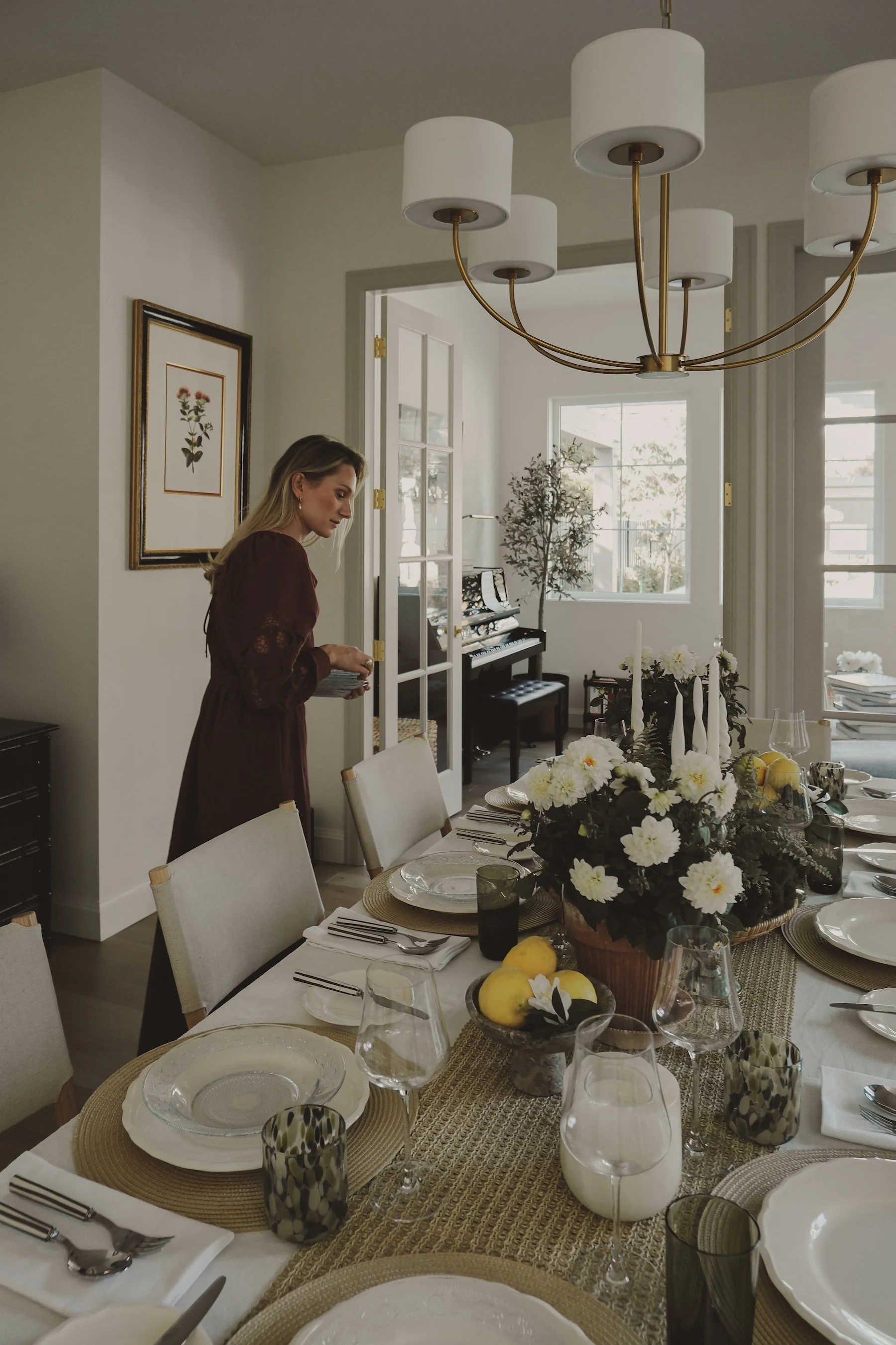
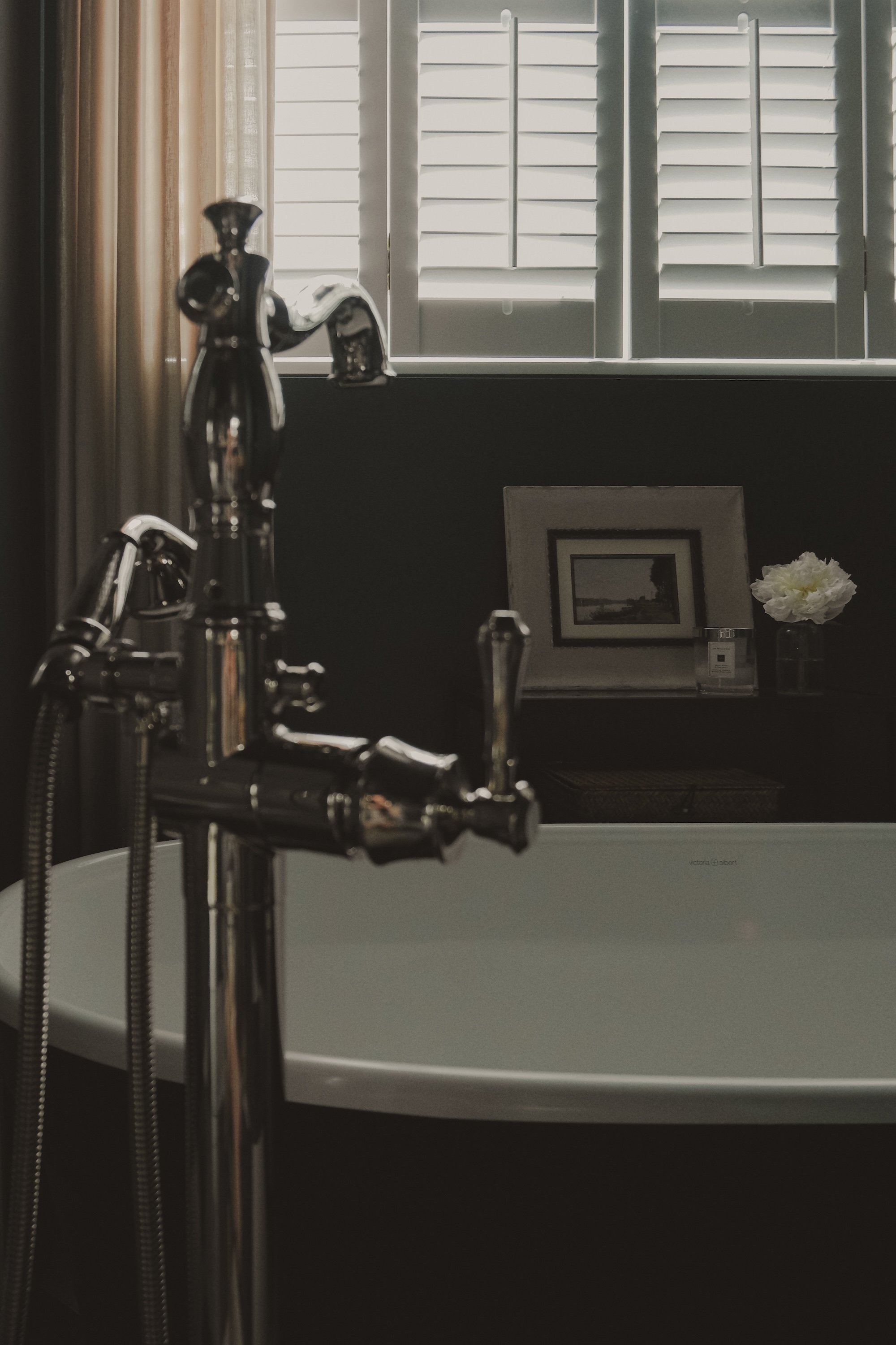
A brand designed for the beauty of real life
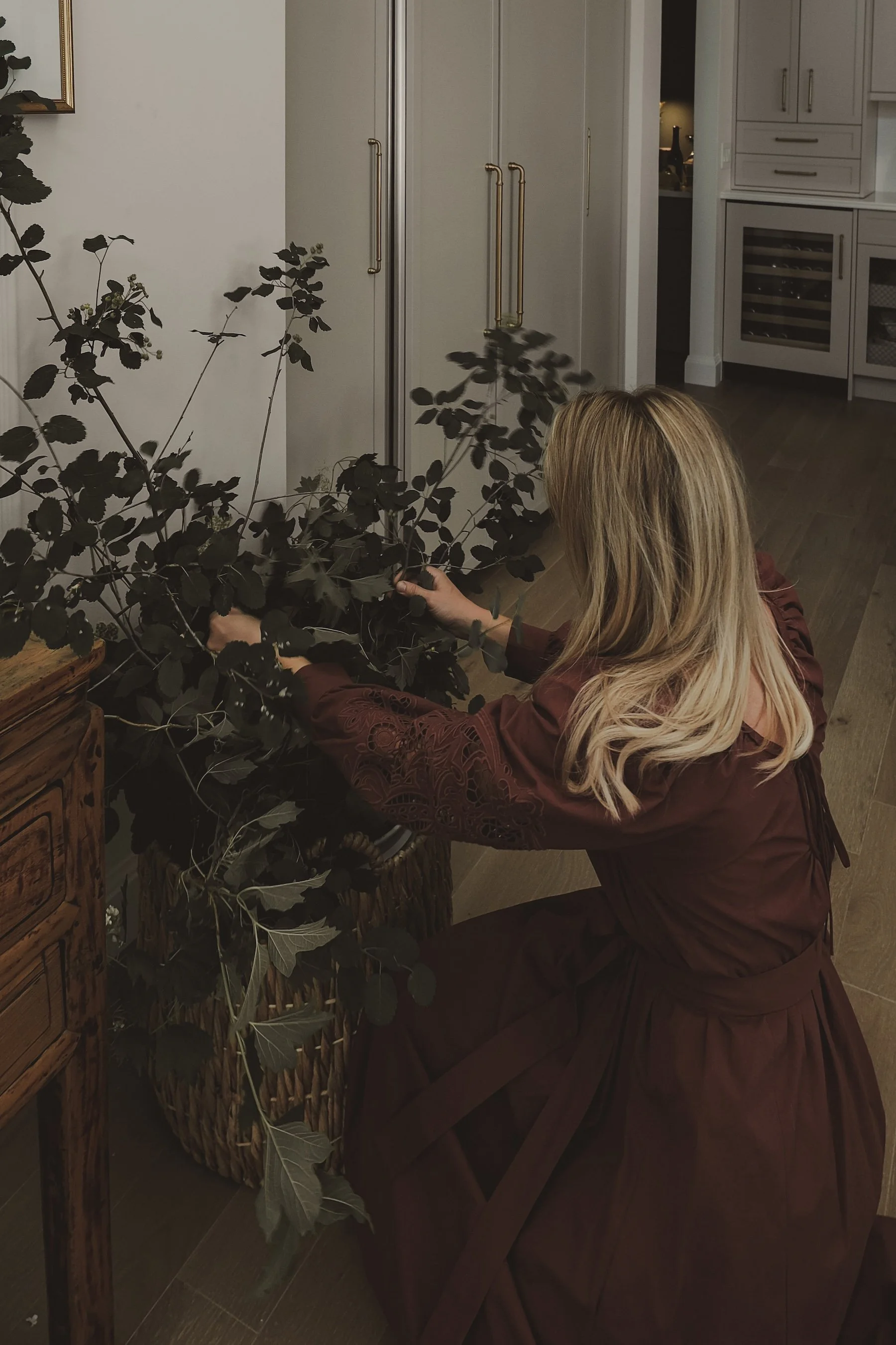
Kim Gilchrist Interiors was not built from formal training or industry convention — but from lived experience.
Kim is a mother, a creative, and someone who has spent years shaping a life rooted in family, beauty, and meaning.
When she designed her own home — a space that naturally reflected her taste —
something became clear:
What came intuitively to her
was something others deeply needed.
What she was creating wasn’t just aesthetic.
It was emotional.
It was lived-in.
It was real.

THE OPPORTUNITY
Like many designers, the question wasn’t whether the talent existed —
It was how to translate:
Her natural eye
Her personable nature
Her lived experience
Into a brand that could be clearly understood — and deeply felt.
The goal was not to create something new.
It was to translate her essence into identity.

THE CHALLENGE
With limited availability, Kim needed to attract a very specific client.
Not just anyone — but people who felt aligned with how she sees and shapes a home.
To do that, the brand needed to communicate:
A clearly defined aesthetic
Emotional depth at every touchpoint
Language that felt understood — not generic
A point of view that was distinct within her market
Because without clarity,
even the most beautiful work becomes diluted.
And in Kelowna — where the market leans either:
high-gloss MODERN
or safe, traditional design
There was a clear gap.
No one was owning the space in between.

THE STRATEGY
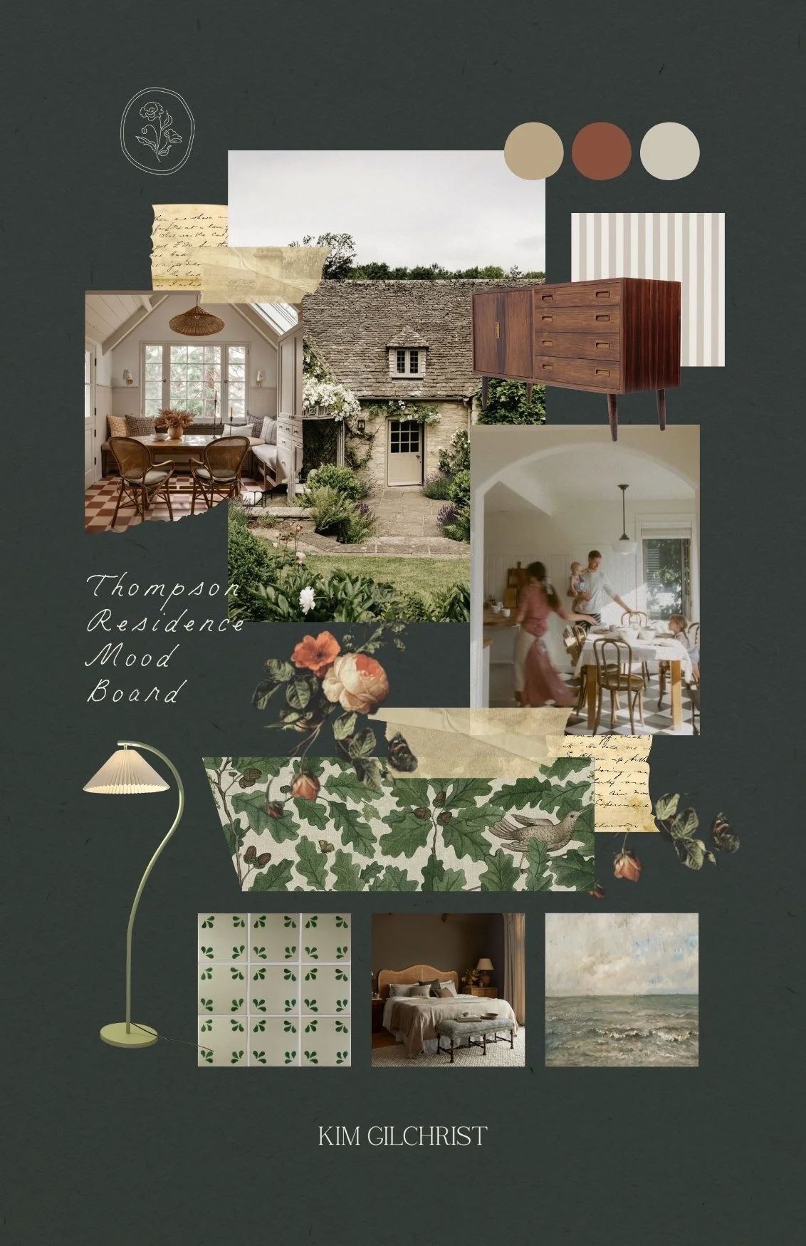
Turn instinct into identity
01 — DEFINE THE BRAND CORE
The foundation wasn’t invented — it was revealed.
Kim’s brand was built around what was already resonant:
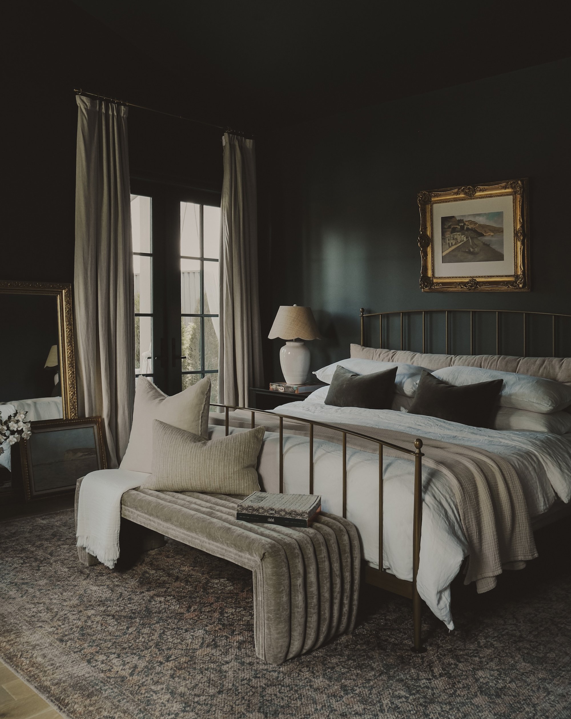
Warmth
Nostalgia
Ease
Authenticity
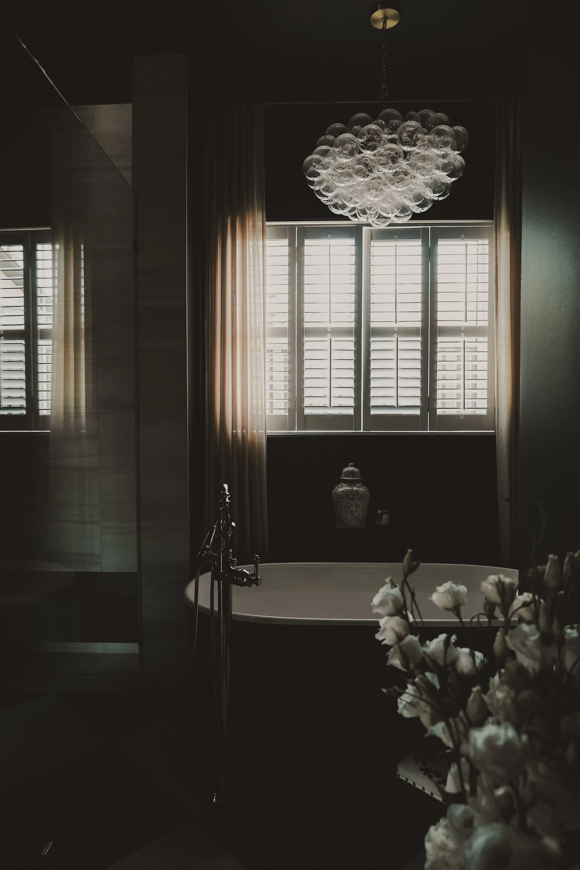
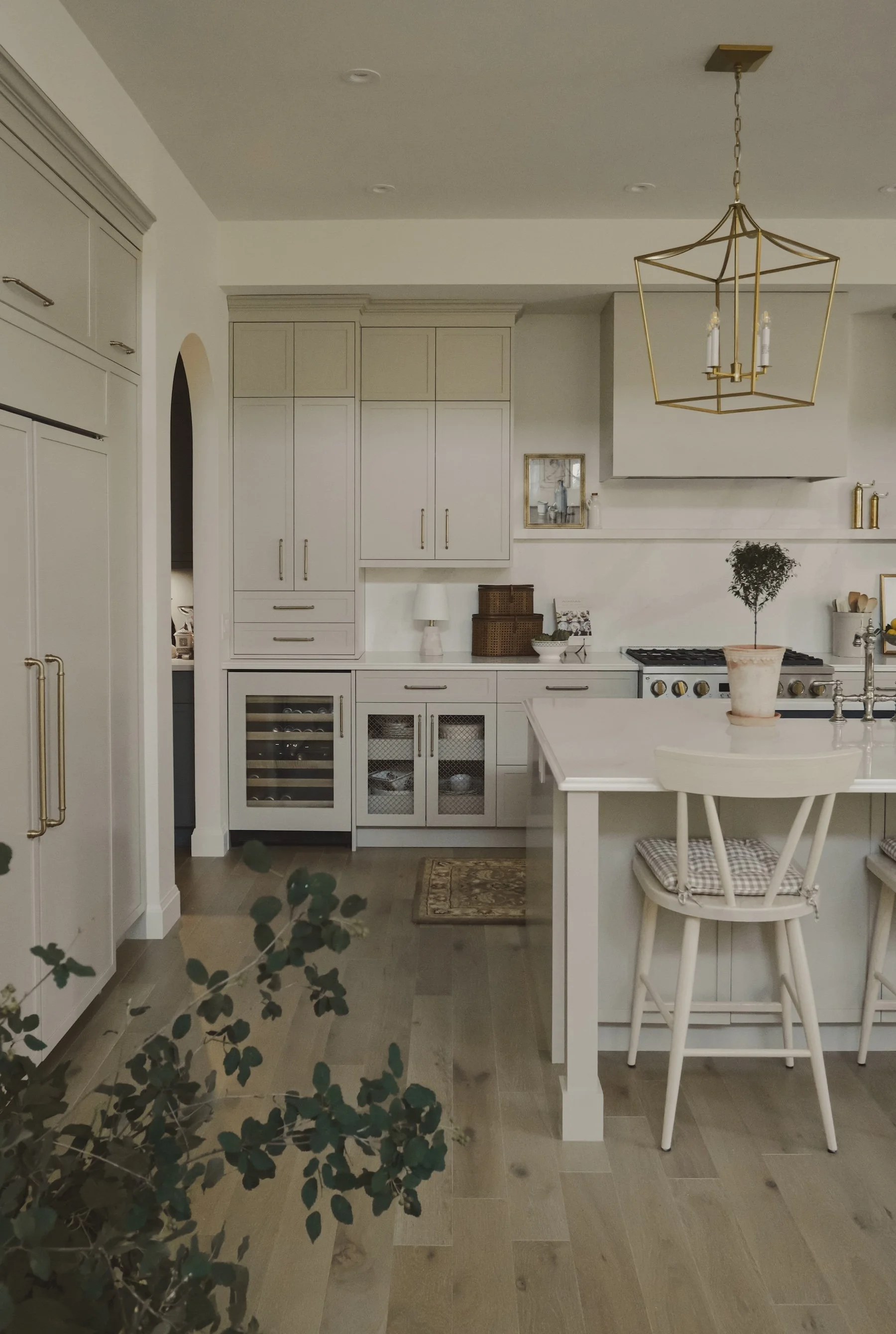
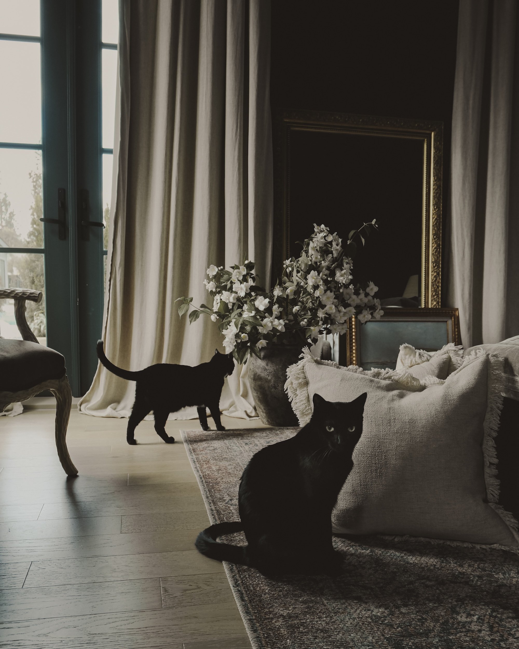
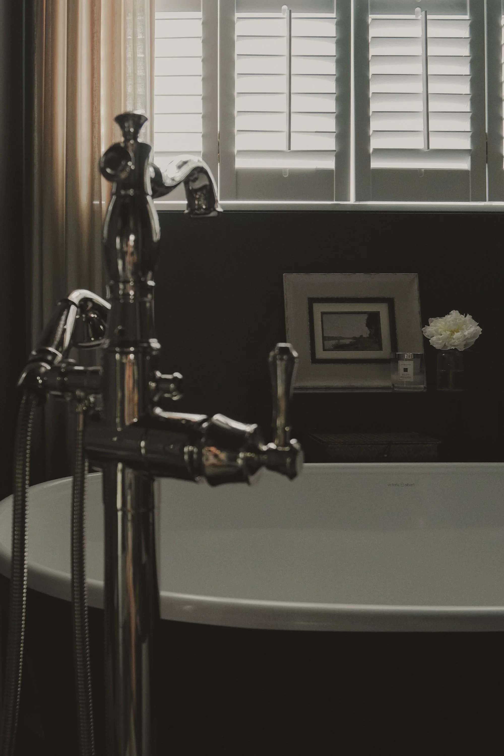
Lived-in beauty
Positioning
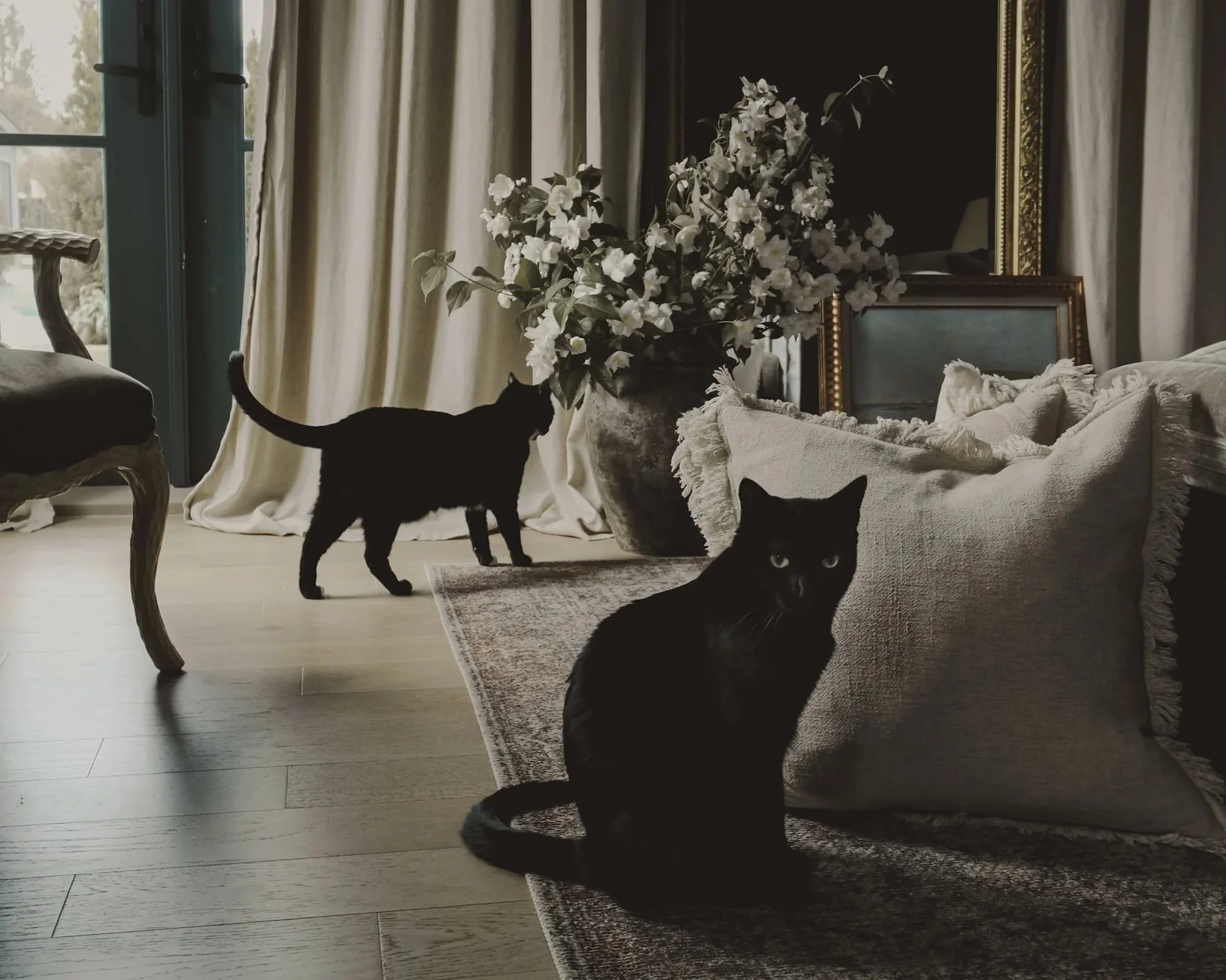
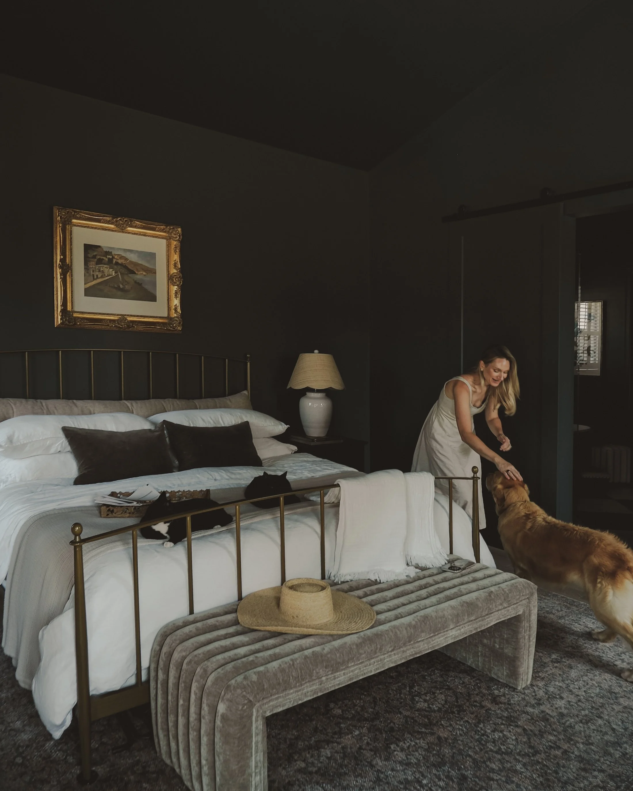
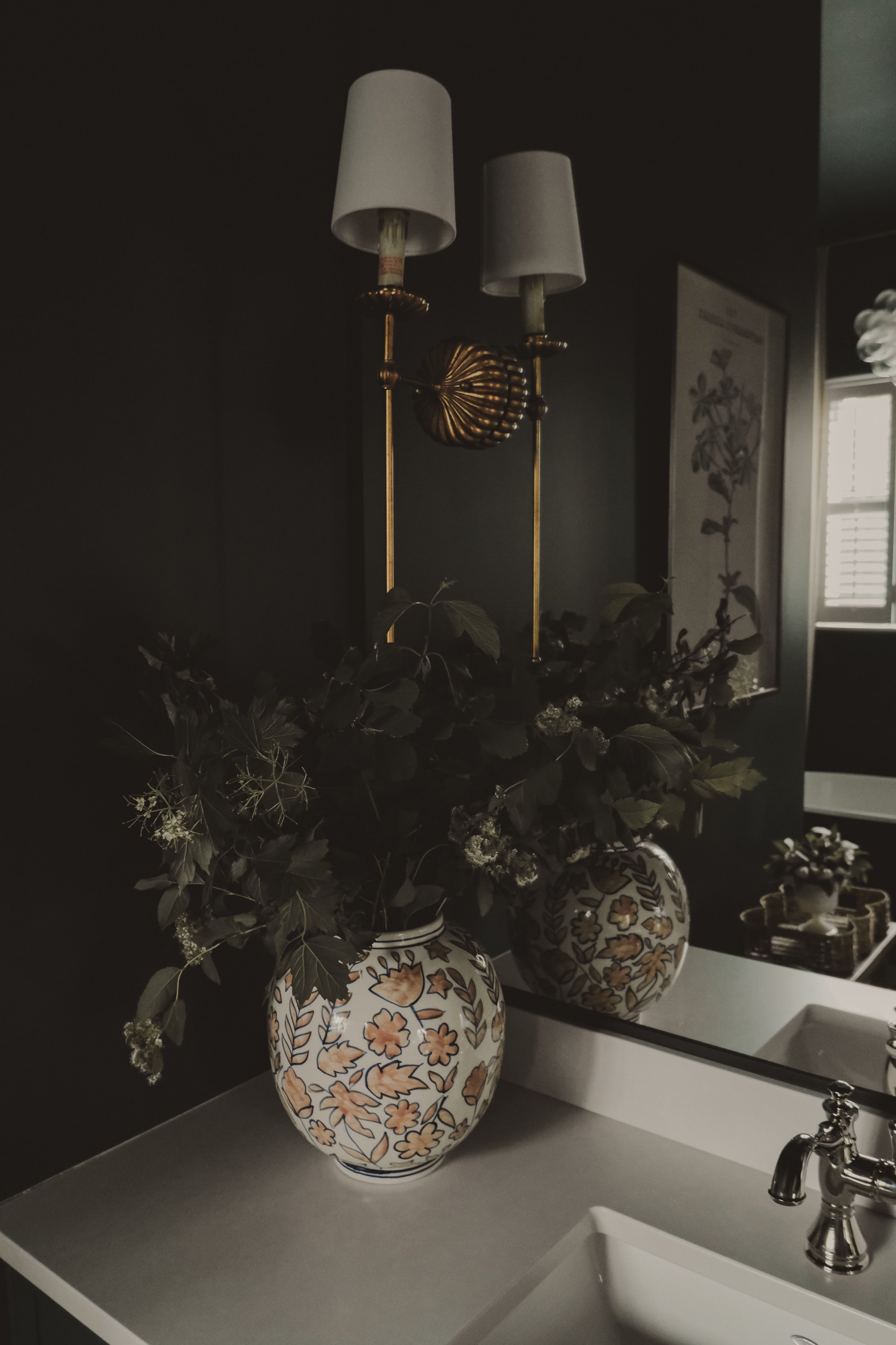
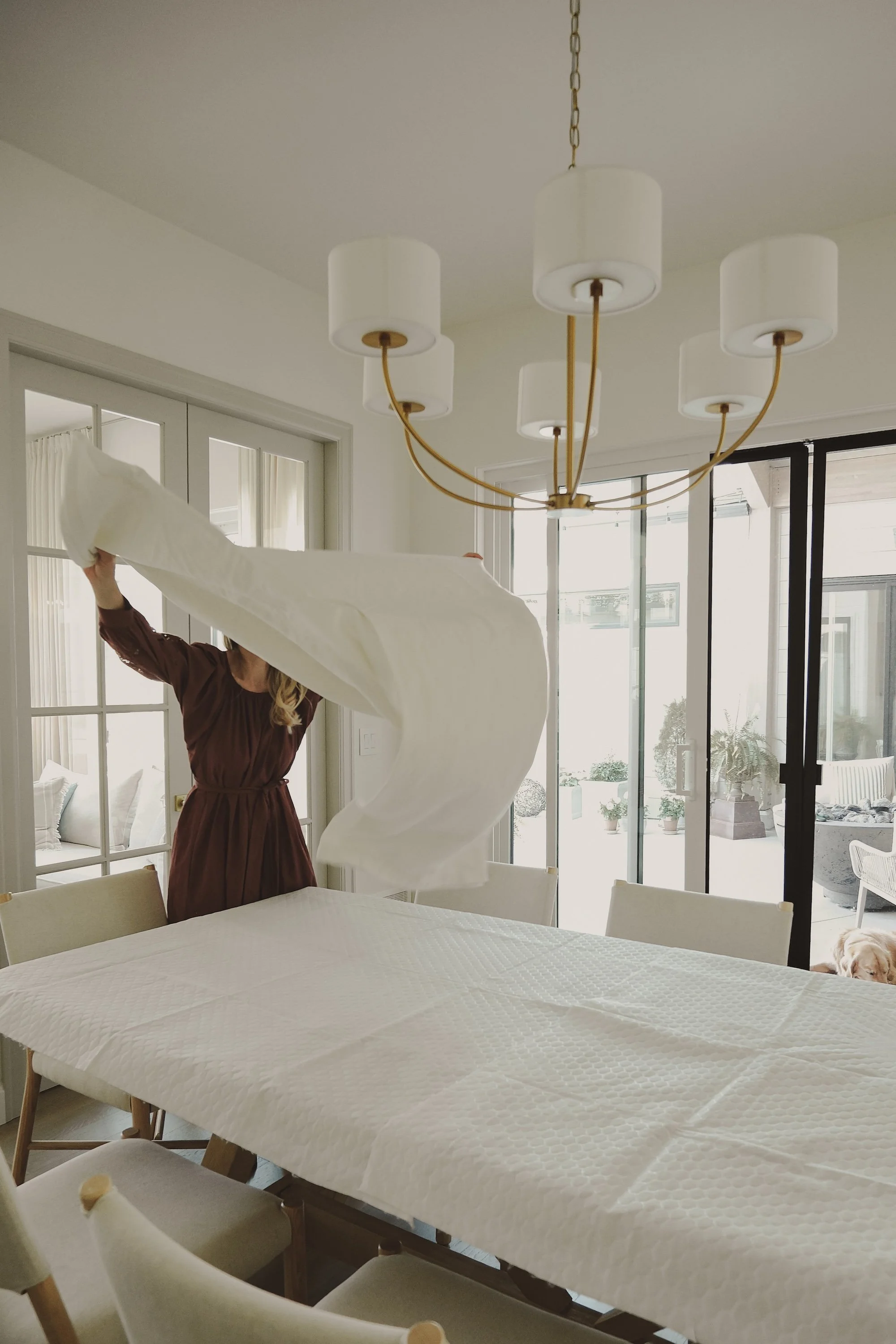
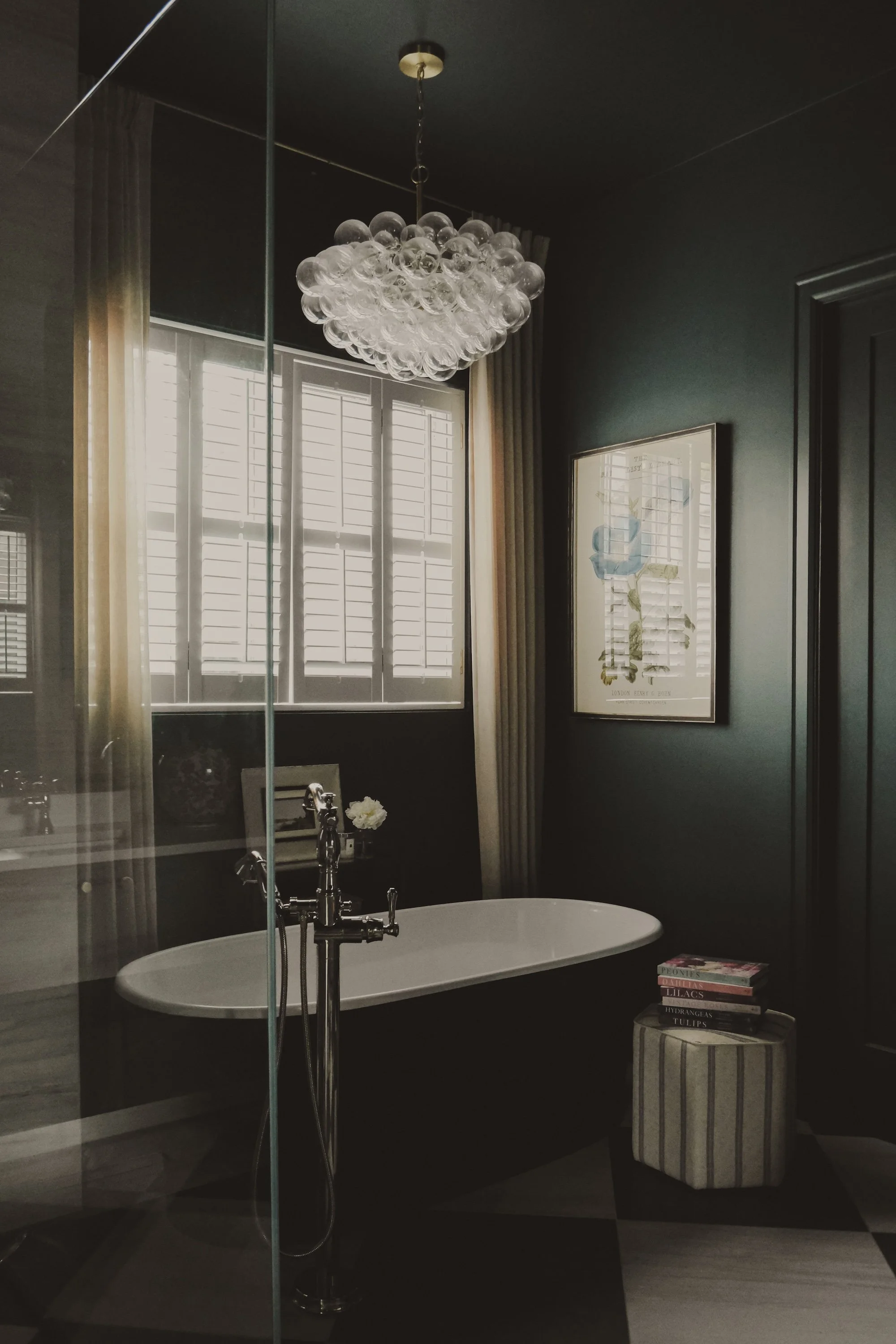
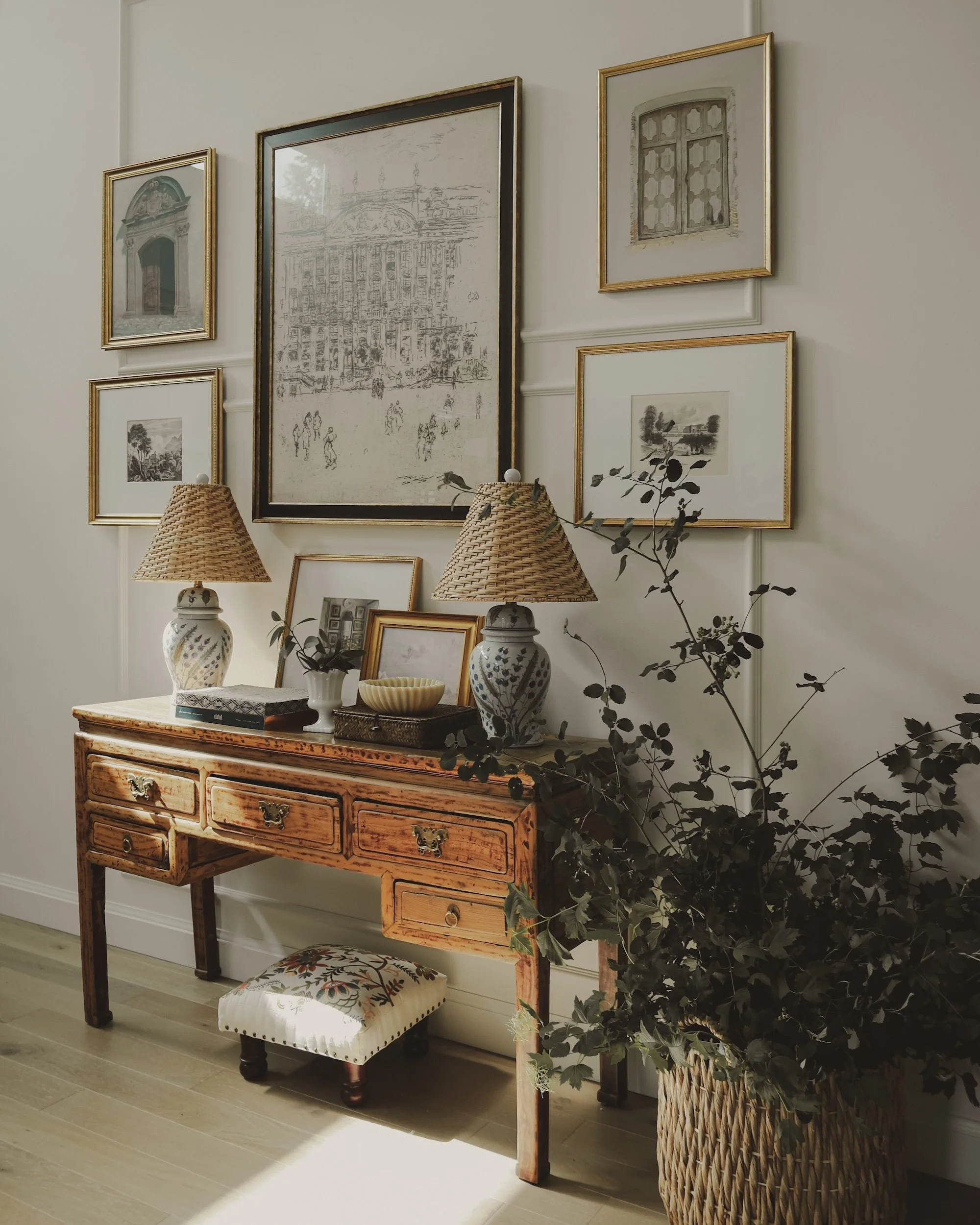
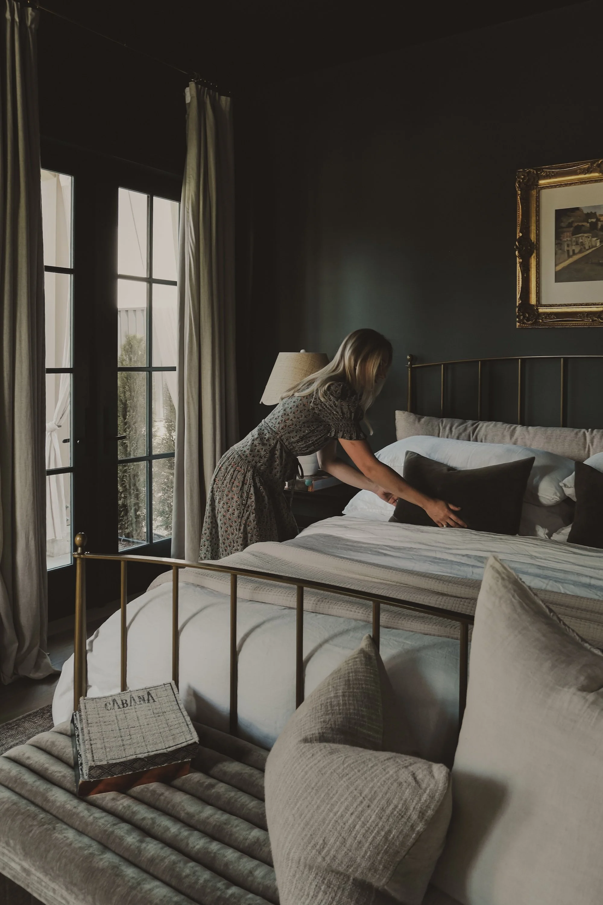
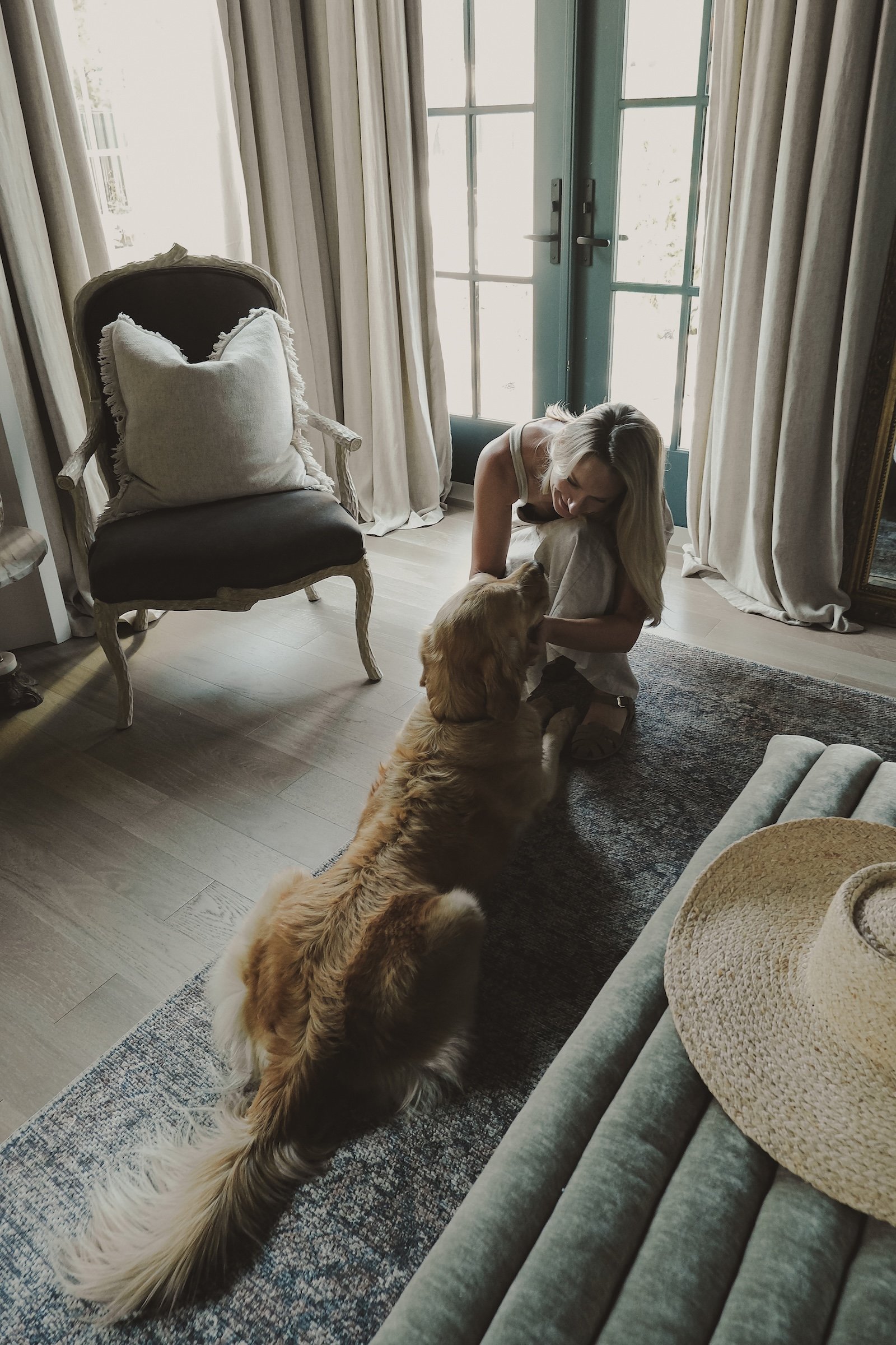
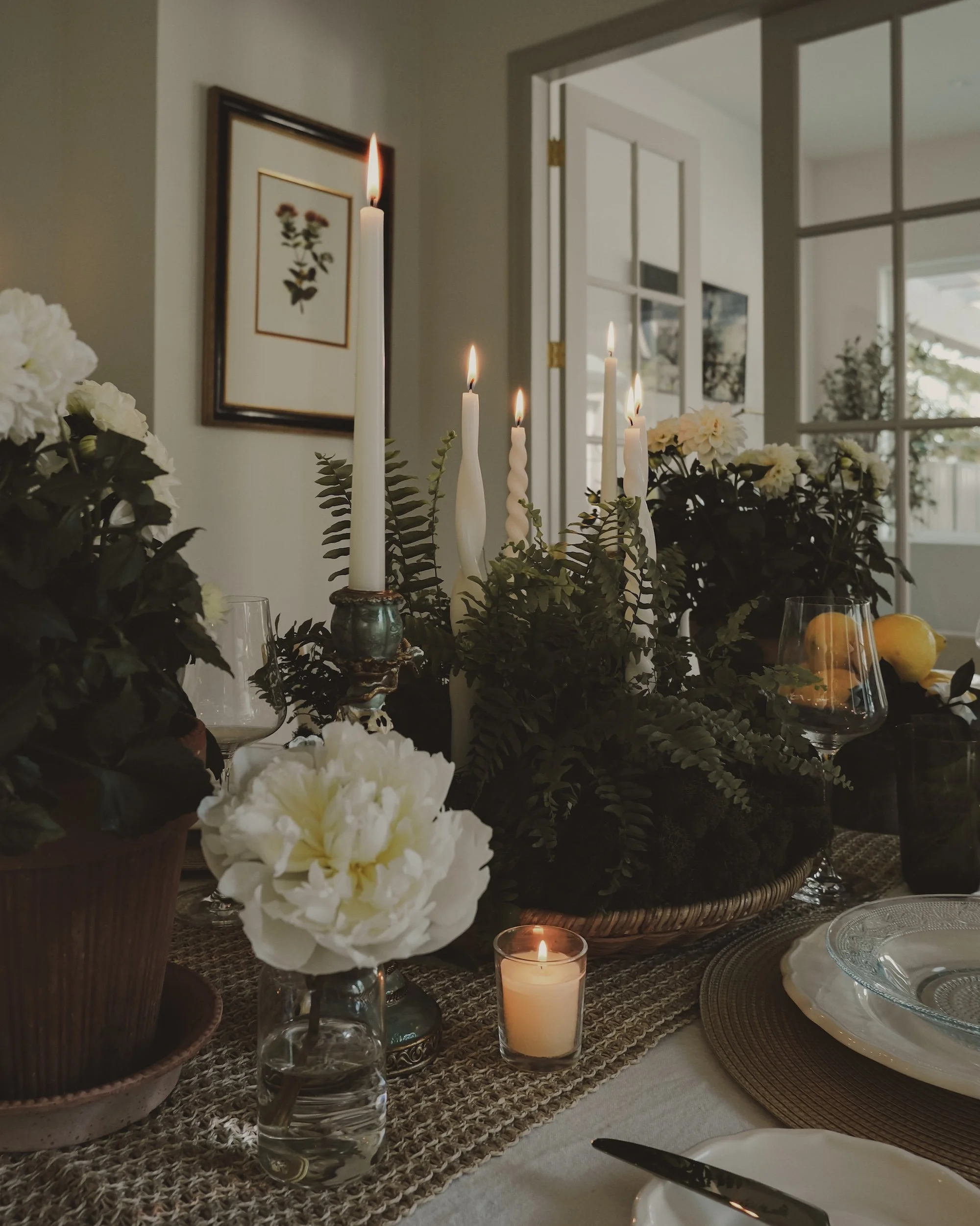
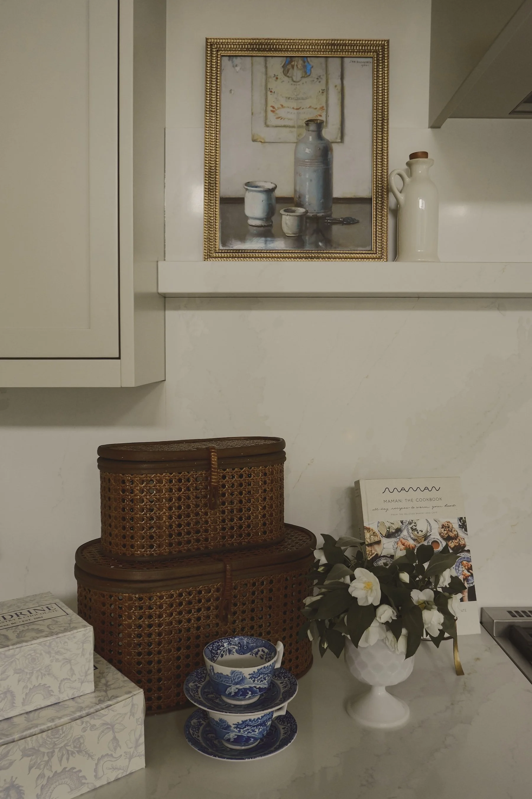
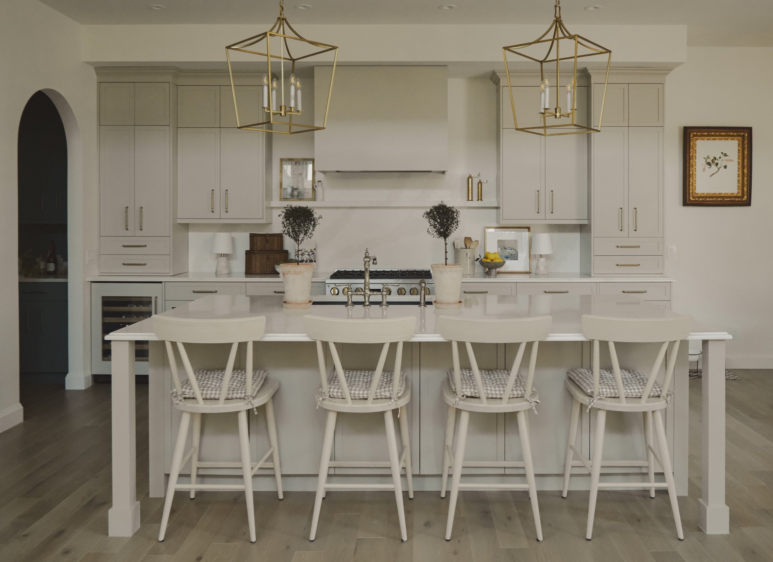
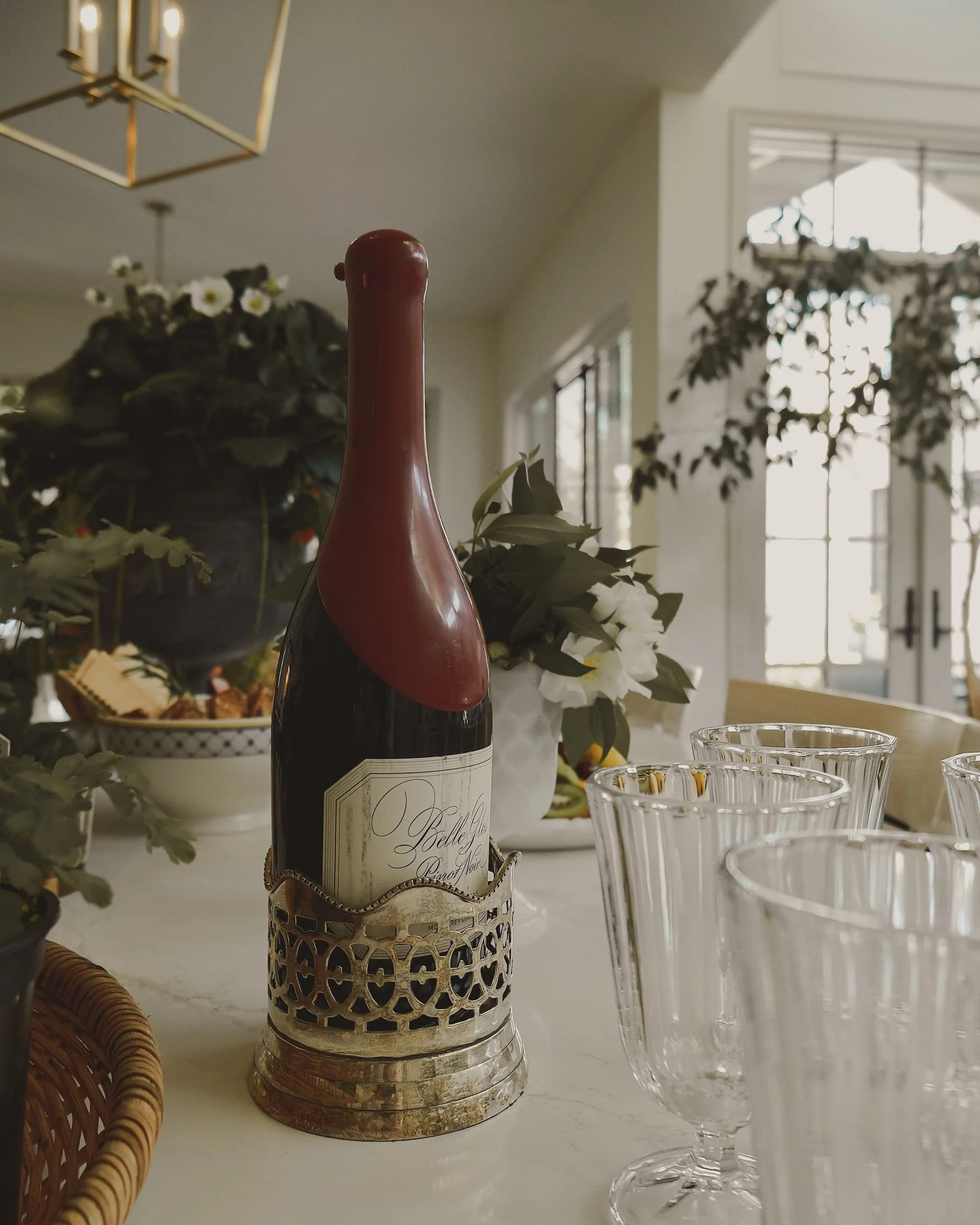
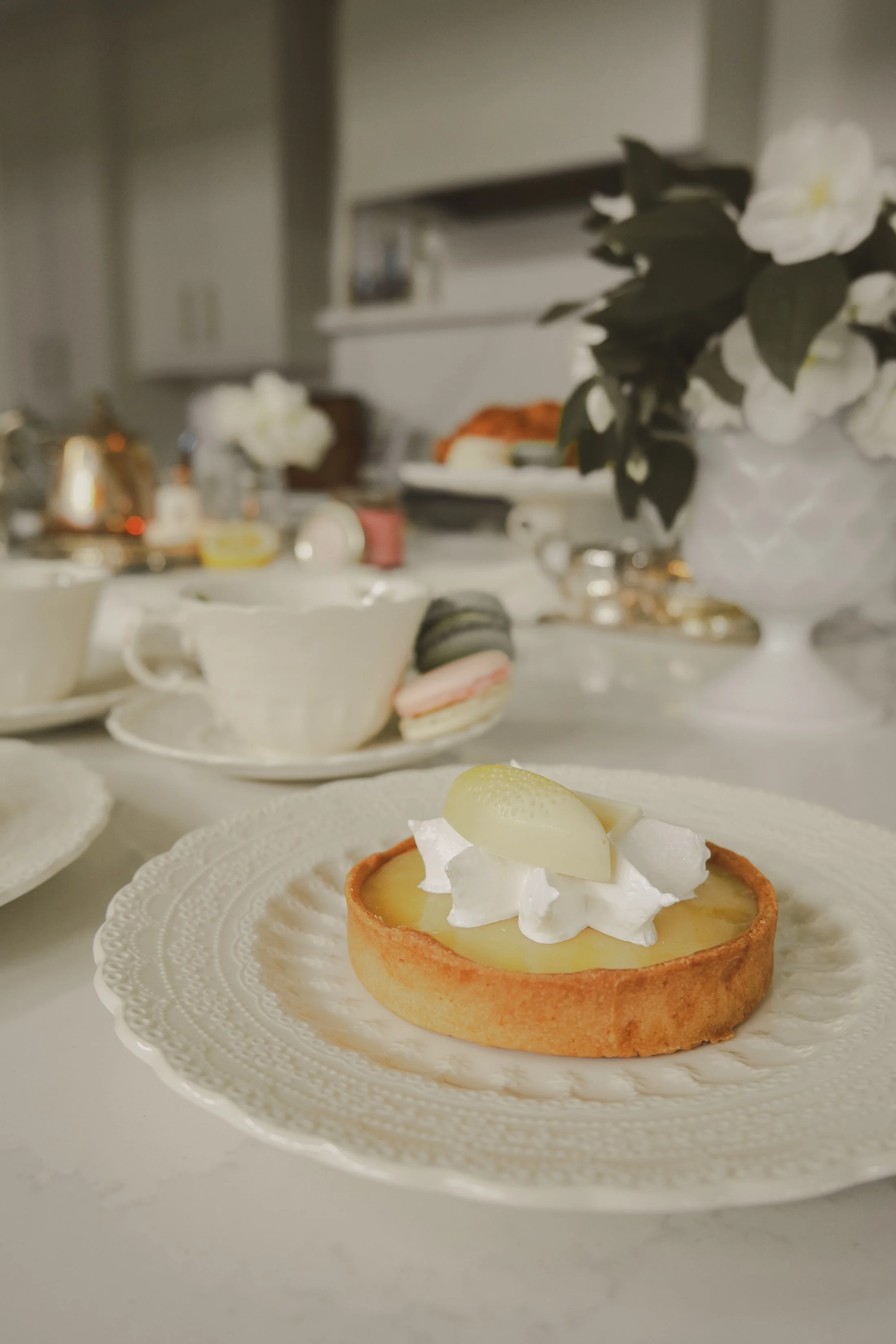
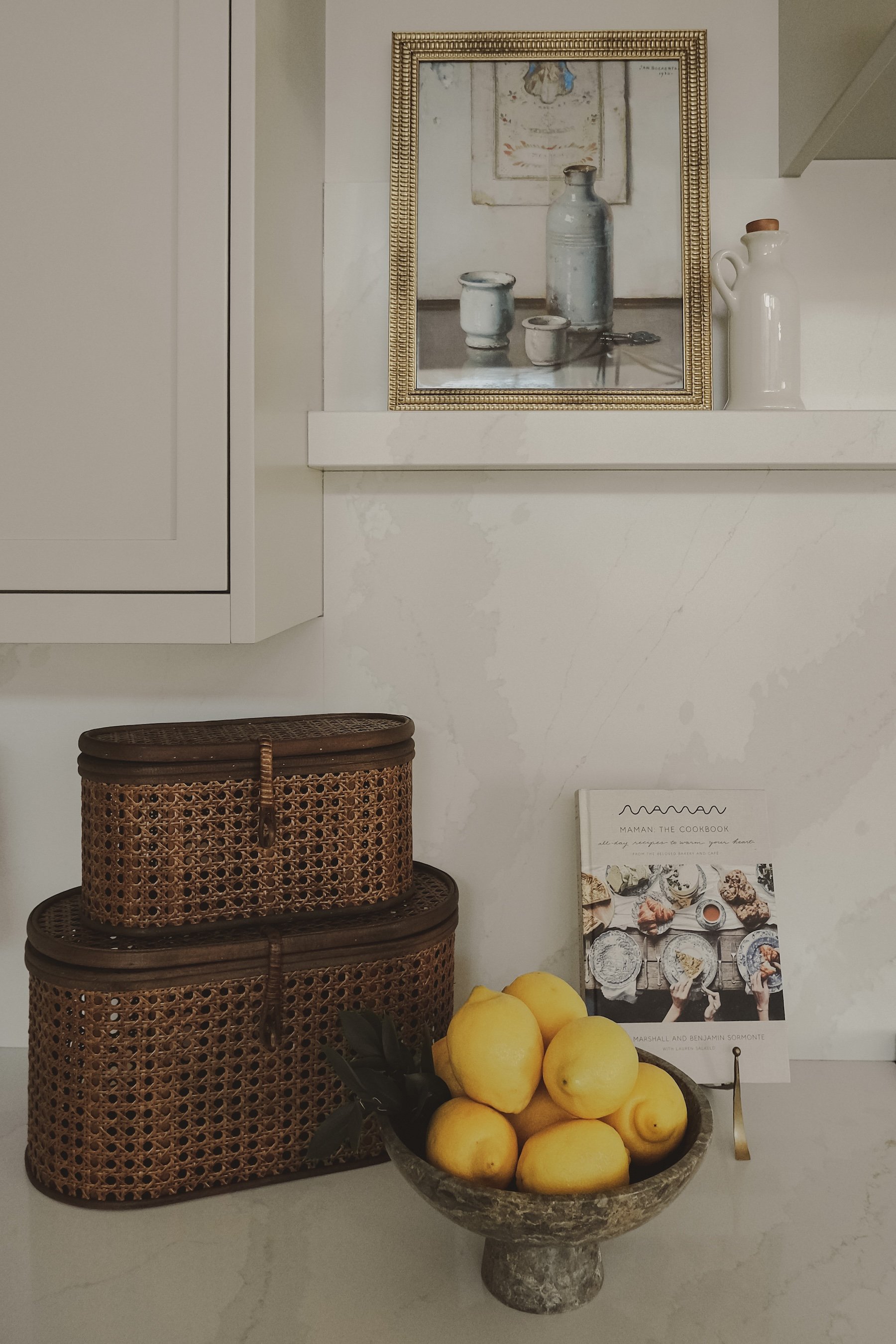
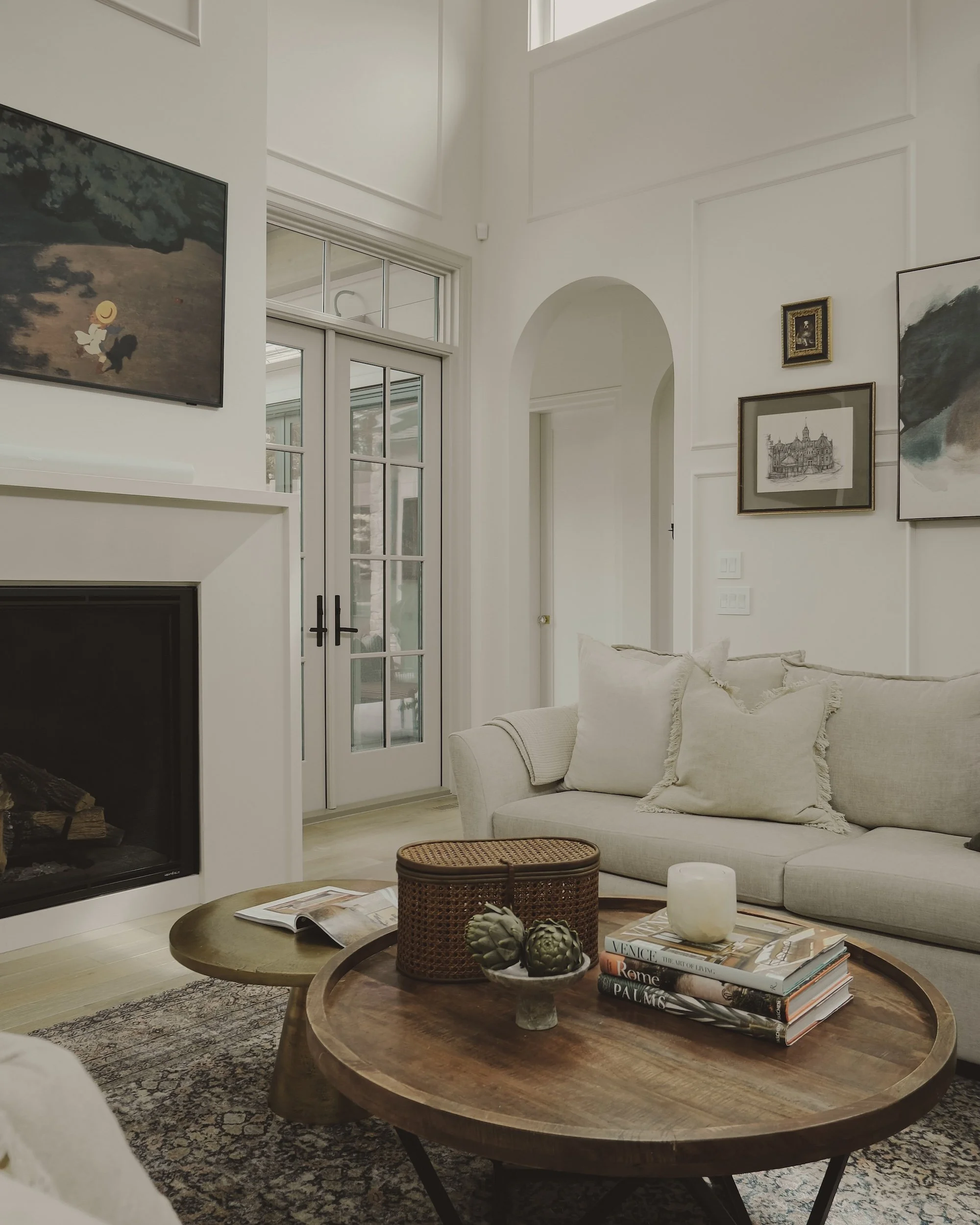
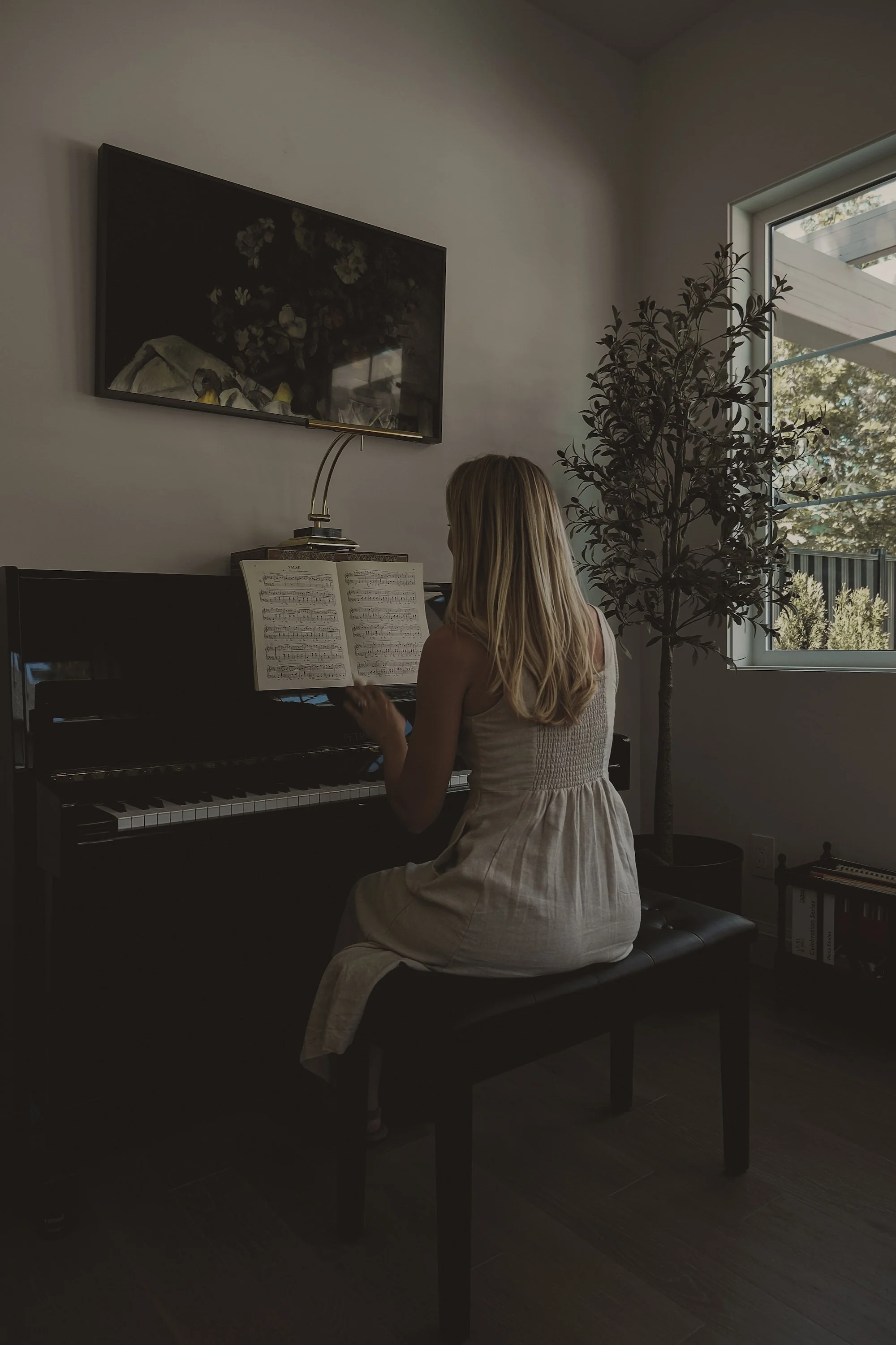
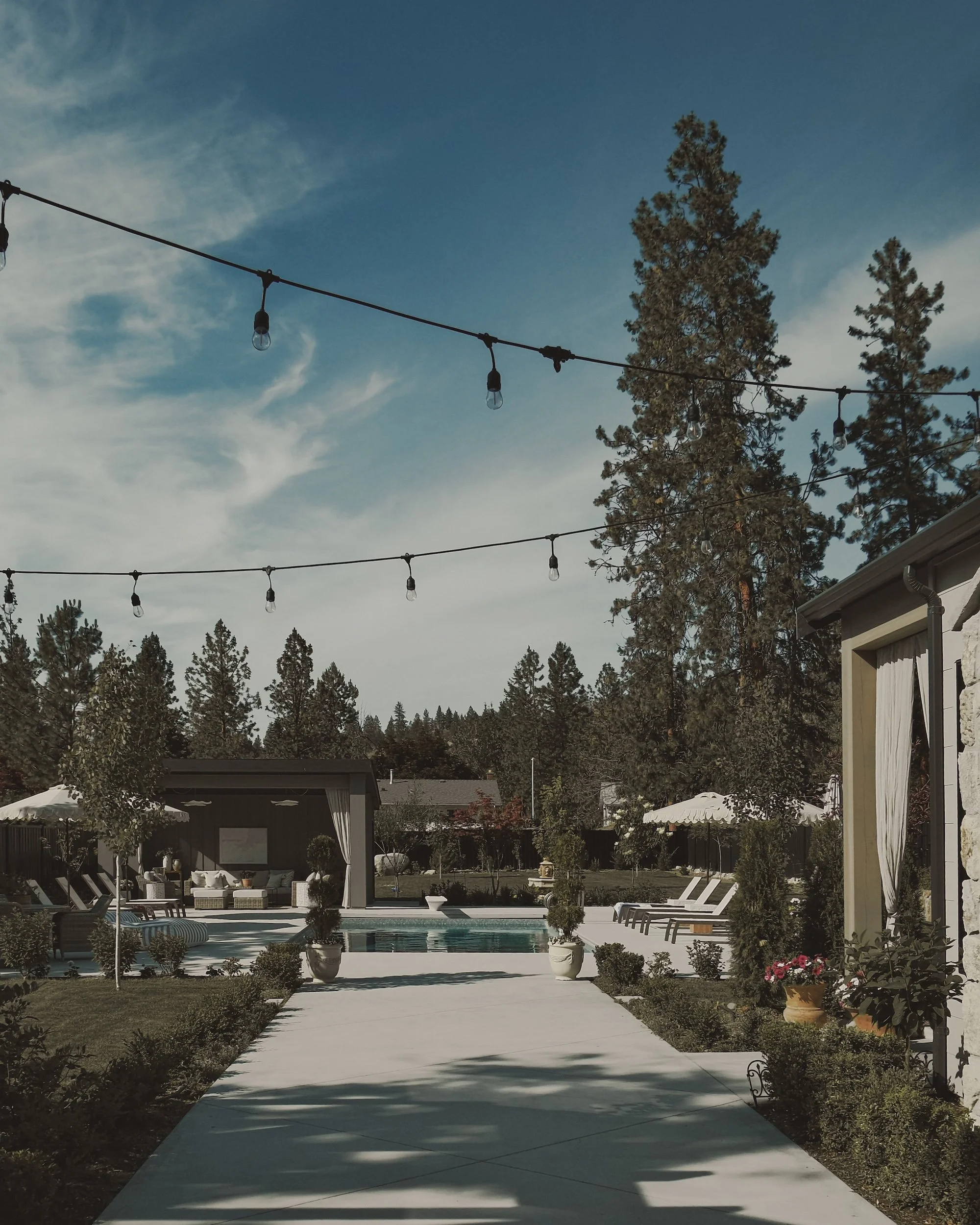
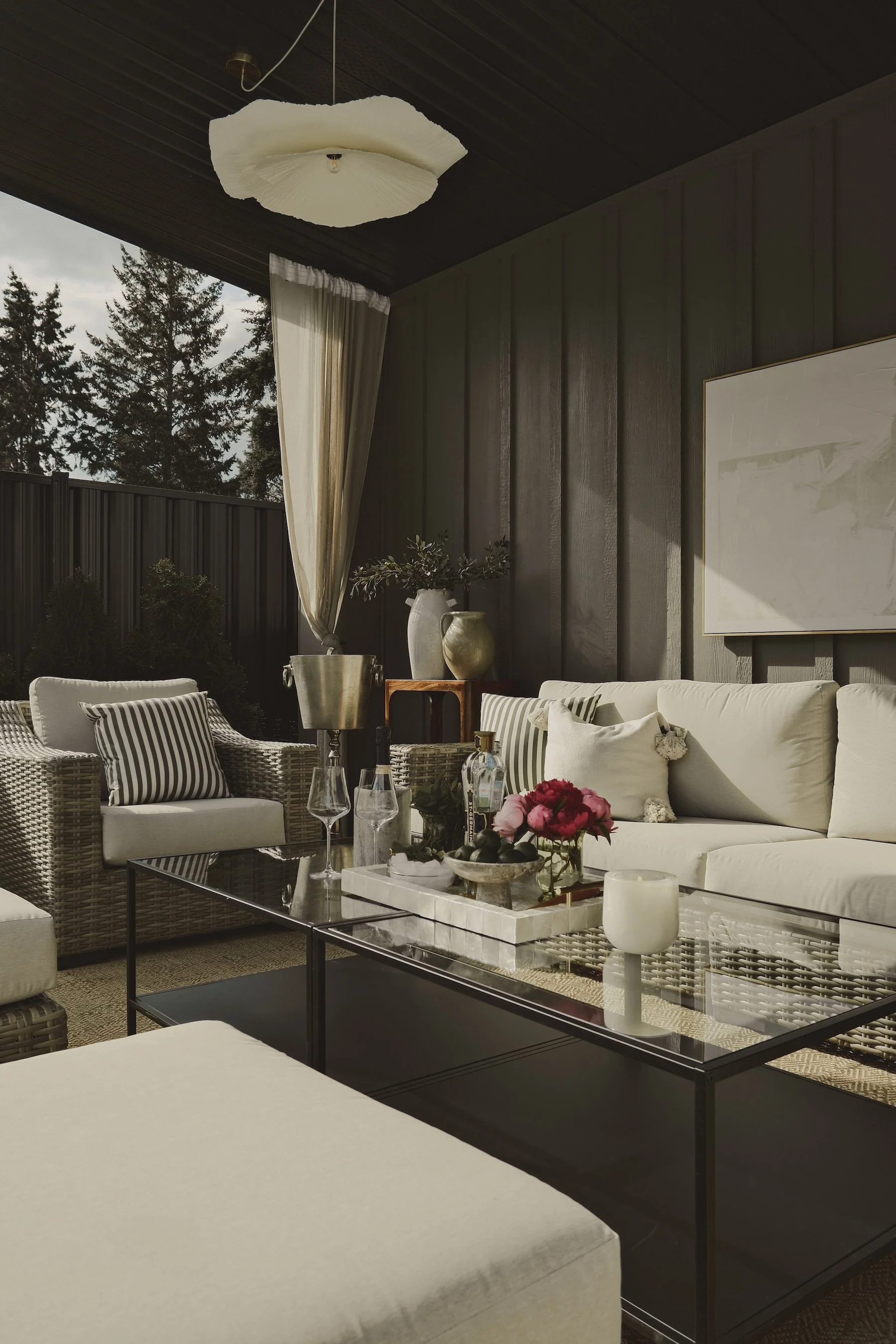
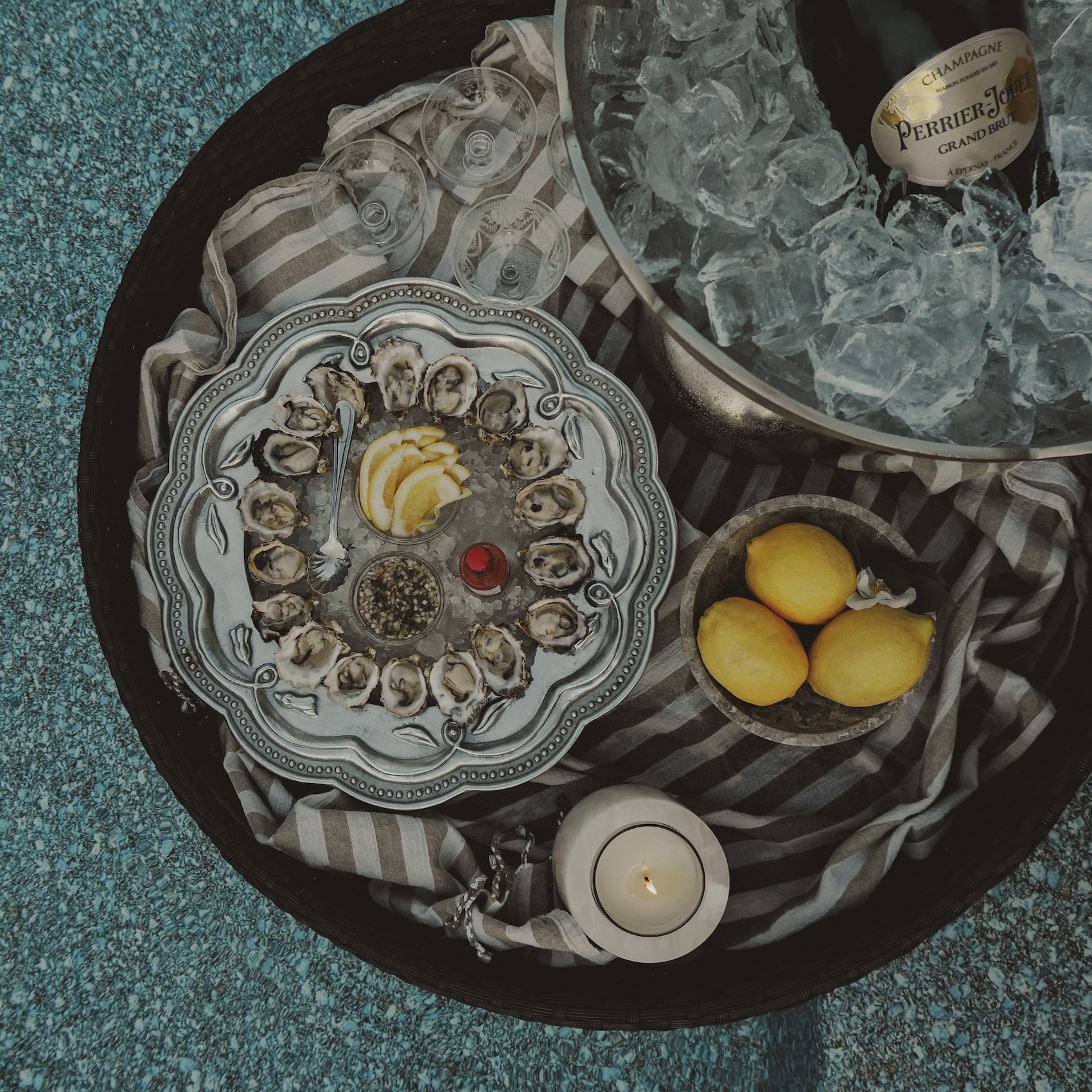
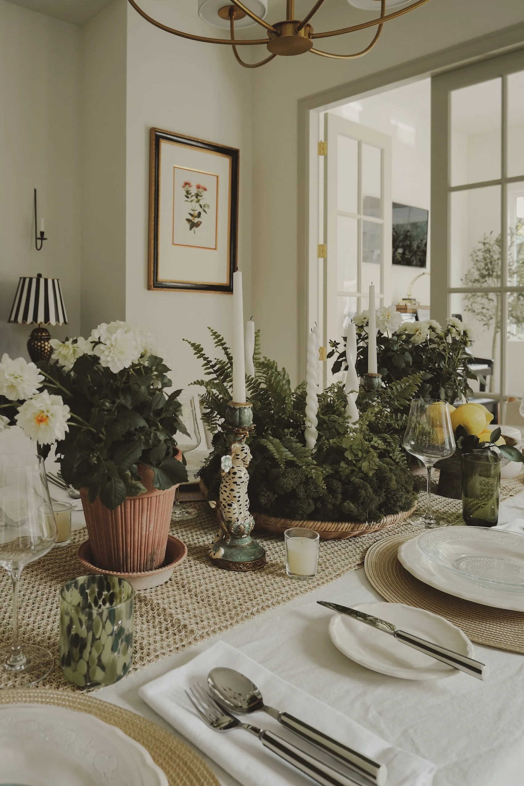
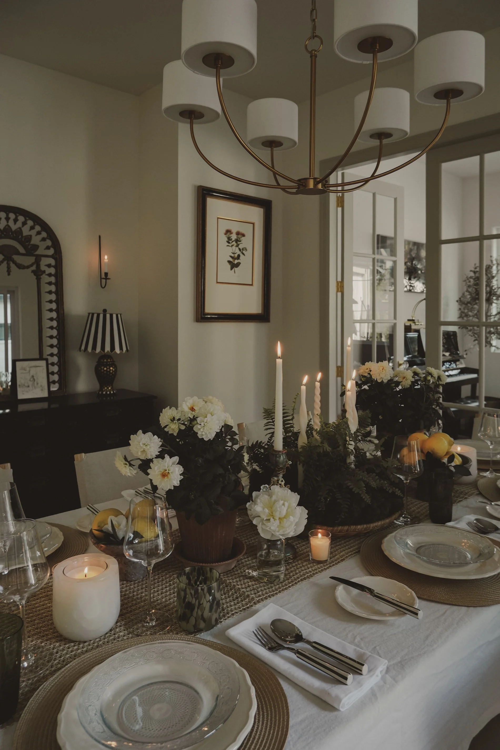
For design-conscious families and individuals who value authenticity over trends, Kim Gilchrist Interiors creates warm, nostalgic spaces that feel effortless, personal, and deeply lived in.
Key Messages
Homes with Heart
Spaces layered with meaning — designed to be lived in and loved.
Design for the Beauty of Real Life
Not perfection — presence. A home that supports how you actually live.
Elevated, Soulful, Intentional
Natural materials, vintage charm, and timeless design — with a fresh perspective.
Authenticity Over Trends
Homes that reflect the people who live in them.
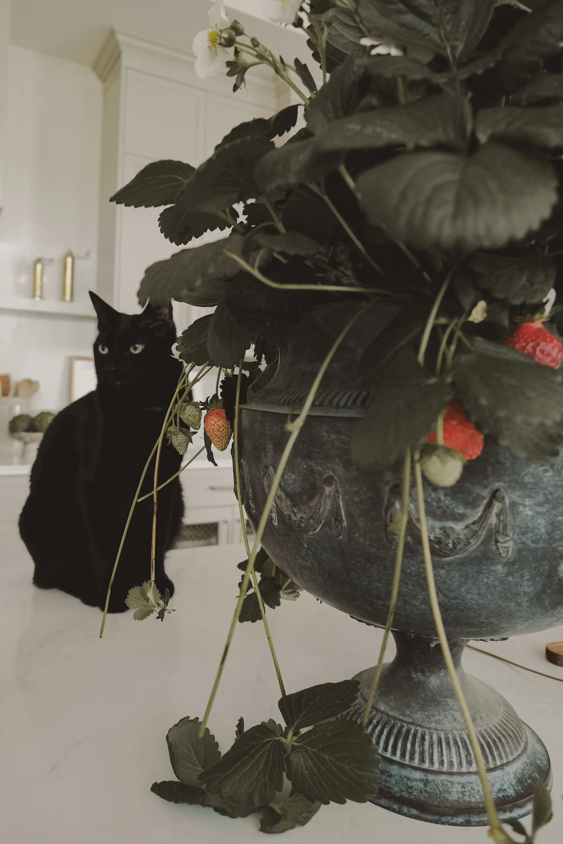
Everyday Magic
Soft mornings, garden clippings, quiet rituals — and the feeling of being at home in your life.
02 — BUILD EMOTIONAL DIFFERENTIATION
In her market, most designers prioritize:
Clean, modern aesthetics
Function and technical execution
Few prioritize feeling.
So the strategy leaned fully into:
Story-rich spaces
Emotional connection over perfection
Homes designed to hold real life
This positioned Kim as more than a decorator.
She became someone who creates the backdrop for a life well lived.
03 — DEFINE THE RIGHT CLIENT
Instead of speaking to everyone, the brand was anchored around three aligned audiences:
HEART-LED millennial families
→ Value beauty and function
→ Want ease, trust, and thoughtful execution
independent, design-conscious womEn
→ See their home as an extension of identity
→ Value meaning, ritual, and collaboration
Empty nesters entering a new chapter
→ Seek refinement, comfort, and PARTNERSHIP
→ Want a process that feels HIGH-TOUCH
04 — ALIGN THE BRAND EXPERIENCE
The brand wasn’t just visual — it was experiential.
Every touchpoint was intentionally designed:
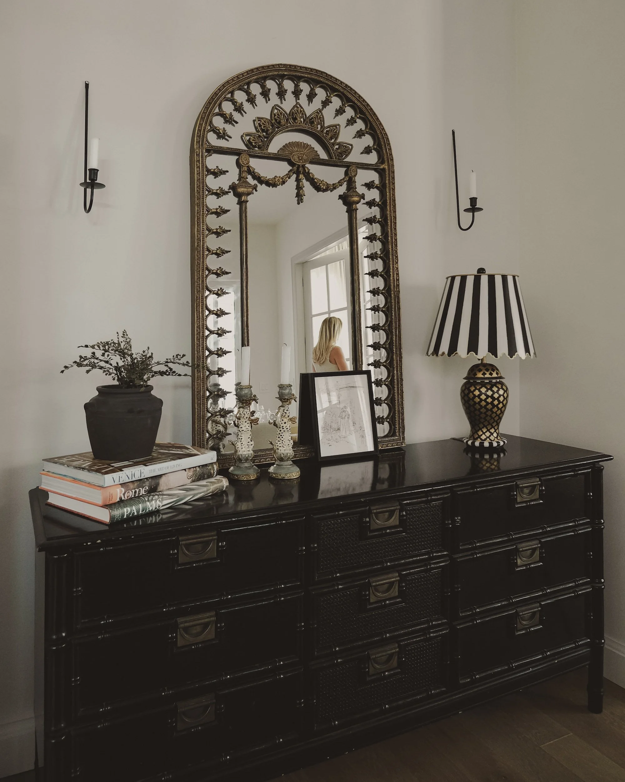
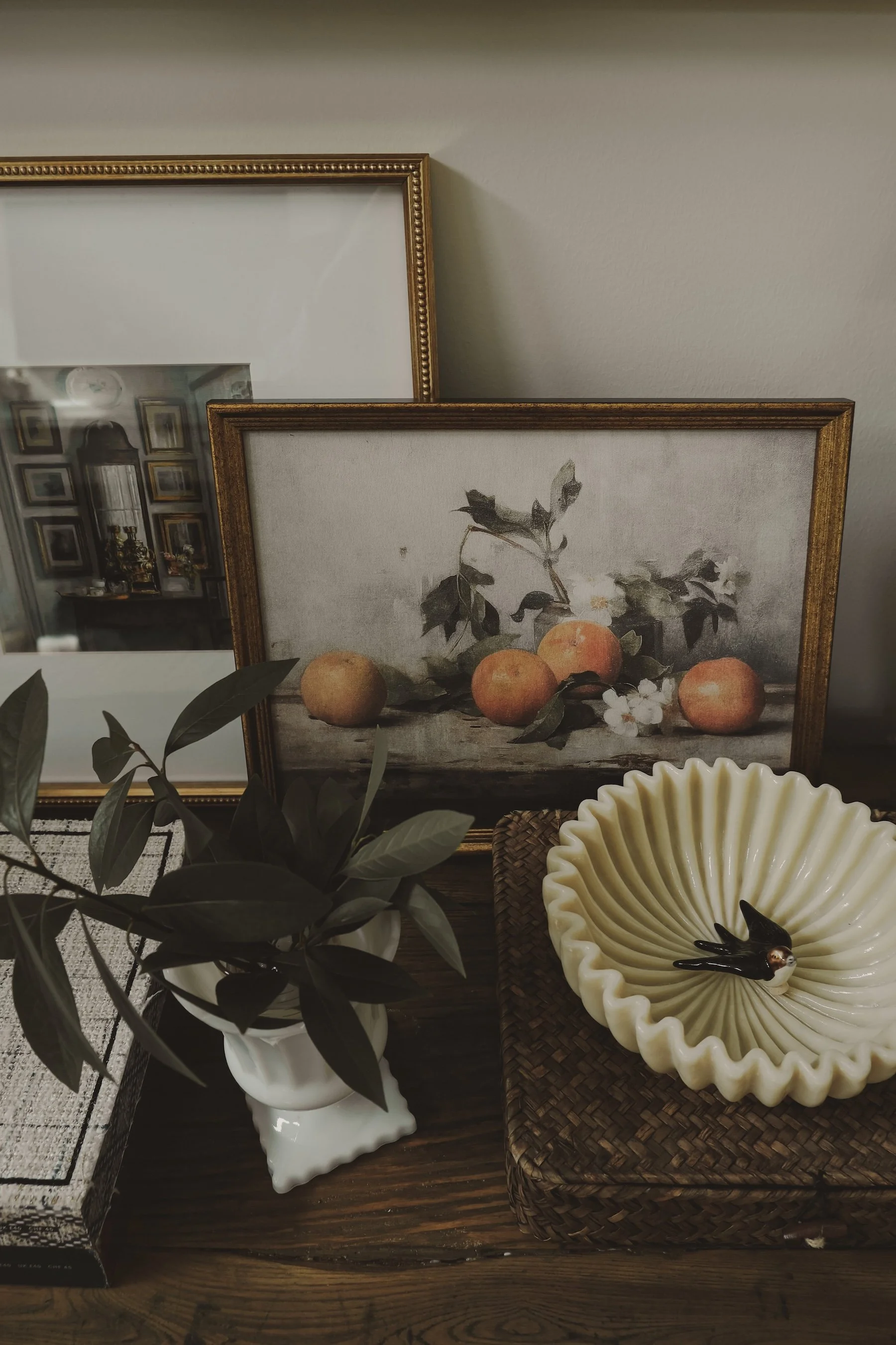
Visual identity → nostalgic, romantic, quietly elevated
Imagery → warm, imperfect, lived-in
Voice → light, grounded, joyful
Website → clear, calm, considered
Social → playful, encouraging, personal
Client experience → high-touch, emotionally attuned
Because a brand is not what you say.
It’s how it feels — at every step.

05 — BUILD FOR LONG-TERM GROWTH
Kim left with more than a visual identity.
She left with a system.
A comprehensive brand blueprint
A complementary AI tool for on-brand content and decision-making
A 90-day action plan to bring the brand to life
Ongoing strategic direction rooted in long-term growth
the outcome
What emerged wasn’t a brand in the traditional sense.
It was something more precise:
A one of one brand — fully aligned with the life it’s designed to support.
Kim Gilchrist Interiors IS NOW KNOWN FOR:
Homes with heart
Lived-in luxury
Spaces layered with story
A softness that invites people in
THE DIFFERENCE
Where others aim to impress —
this brand is built to connect.
Where others design for the photo —
this brand designs for the life inside it.
THE RESULT IS A BRAND that feels:
Personal
Grounded
Distinct
Memorable
And most importantly —
true to the person behind it.


CLIENT WORDS
"Bryony made the entire branding process feel clear, intentional, and honestly, magical. She has a rare ability to really understand who you are and translate that into A BRAND that feels true and beautiful. Her professionalism, organization, and communication were seamless, and I always felt in the loop and completely supported. Thanks to her creative eye, I now have branding that feels deeply 'me'."
- KIM GILCHRIST

THIS IS WHAT ALIGNMENT LOOKS LIKE
A brand that reflects your thinking.
Attracts the right clients.
And allows you to lead with confidence.
If that’s what you’re ready for—